Redesigning the most-used app
on 220 million devices.
Selected as Design Lead 4 years into my career — during Huawei's fastest period of mobile growth. High visibility. Multiple stakeholders. Competing design proposals. My role: synthesise, decide, and ship.
Gallery & Camera — the most commonly used app on Huawei devices, serving 220 million users.
The development team received 100+ negative feedbacks monthly at leadership level alone. Due to resource constraints, only escalated issues were ever collected or addressed — meaning the true scale of user frustration was significantly larger.
The entire project team was under enormous pressure to deliver a complete overhaul.
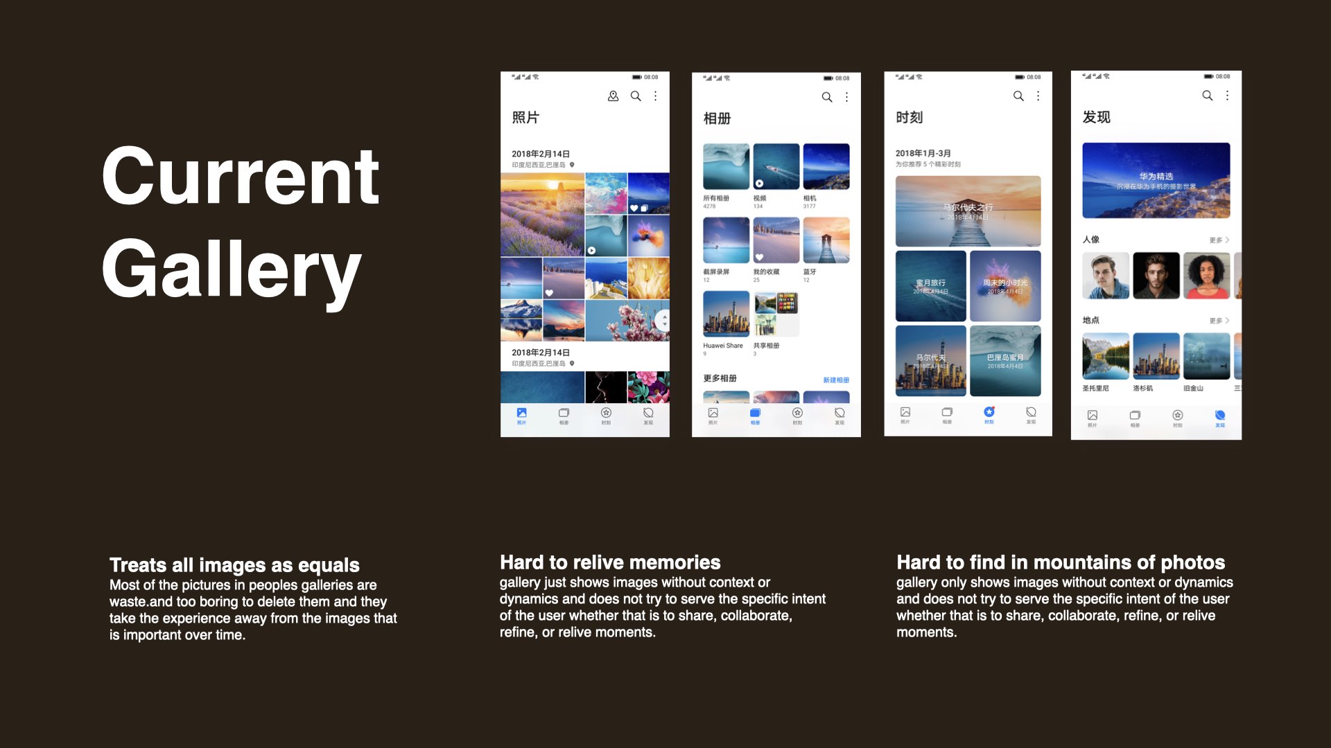
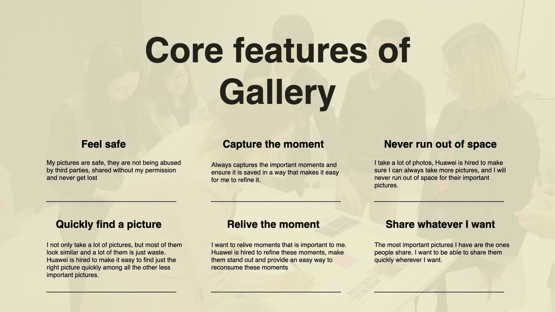
Most photos in a gallery are noise — too forgettable to delete, too numerous to navigate. The app made no distinction between what mattered and what didn't.
Gallery showed images without context or dynamics. It didn't serve the user's real intent — whether that was to share, collaborate, refine, or relive moments.
Search was buried and nearly unusable. Users didn't know where to look, how to search, or that visual search even existed.
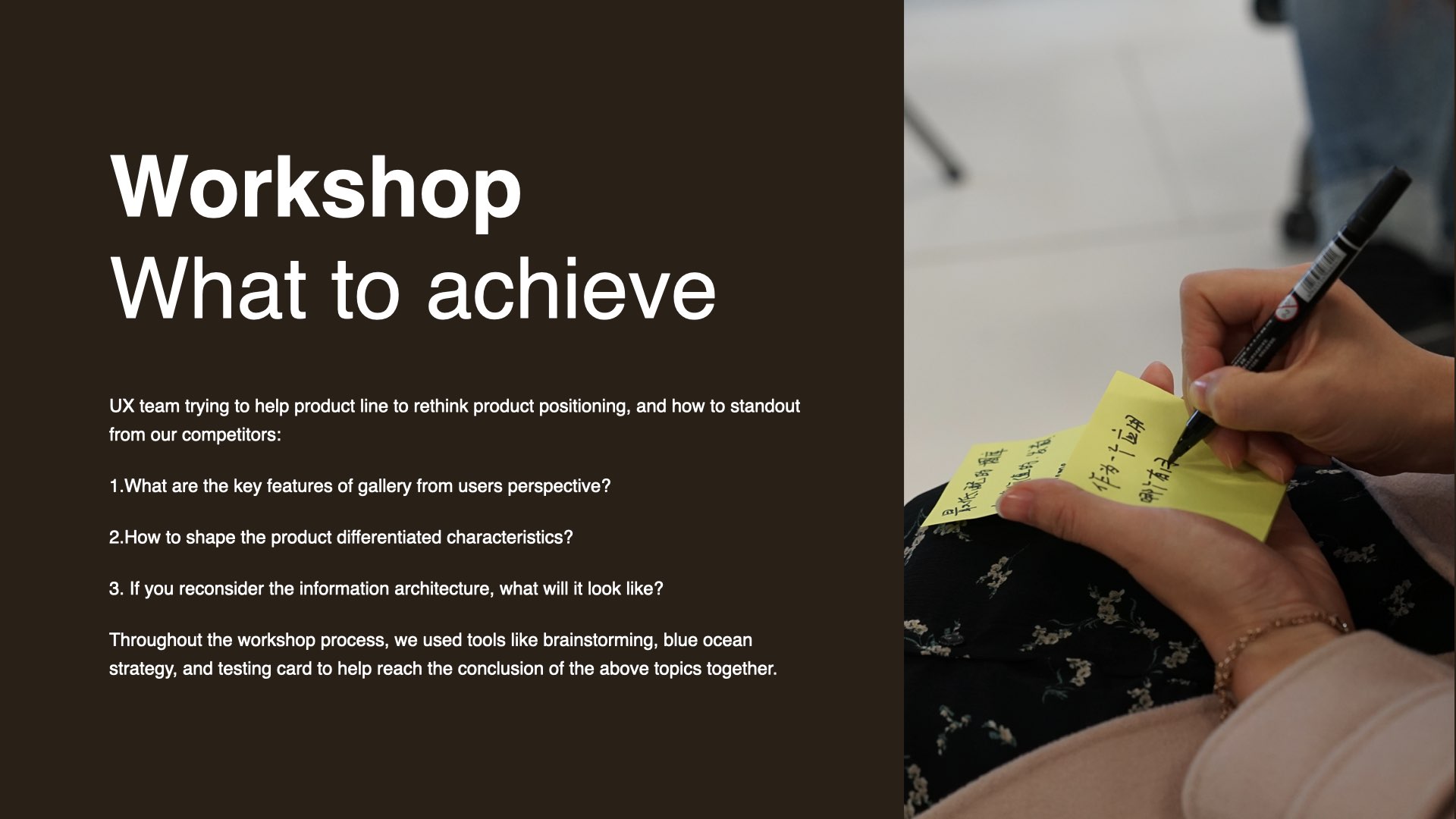
We started with expert user interviews to identify the right directions to explore. Structured workshops followed — not to generate ideas, but to align the product team on where to focus.
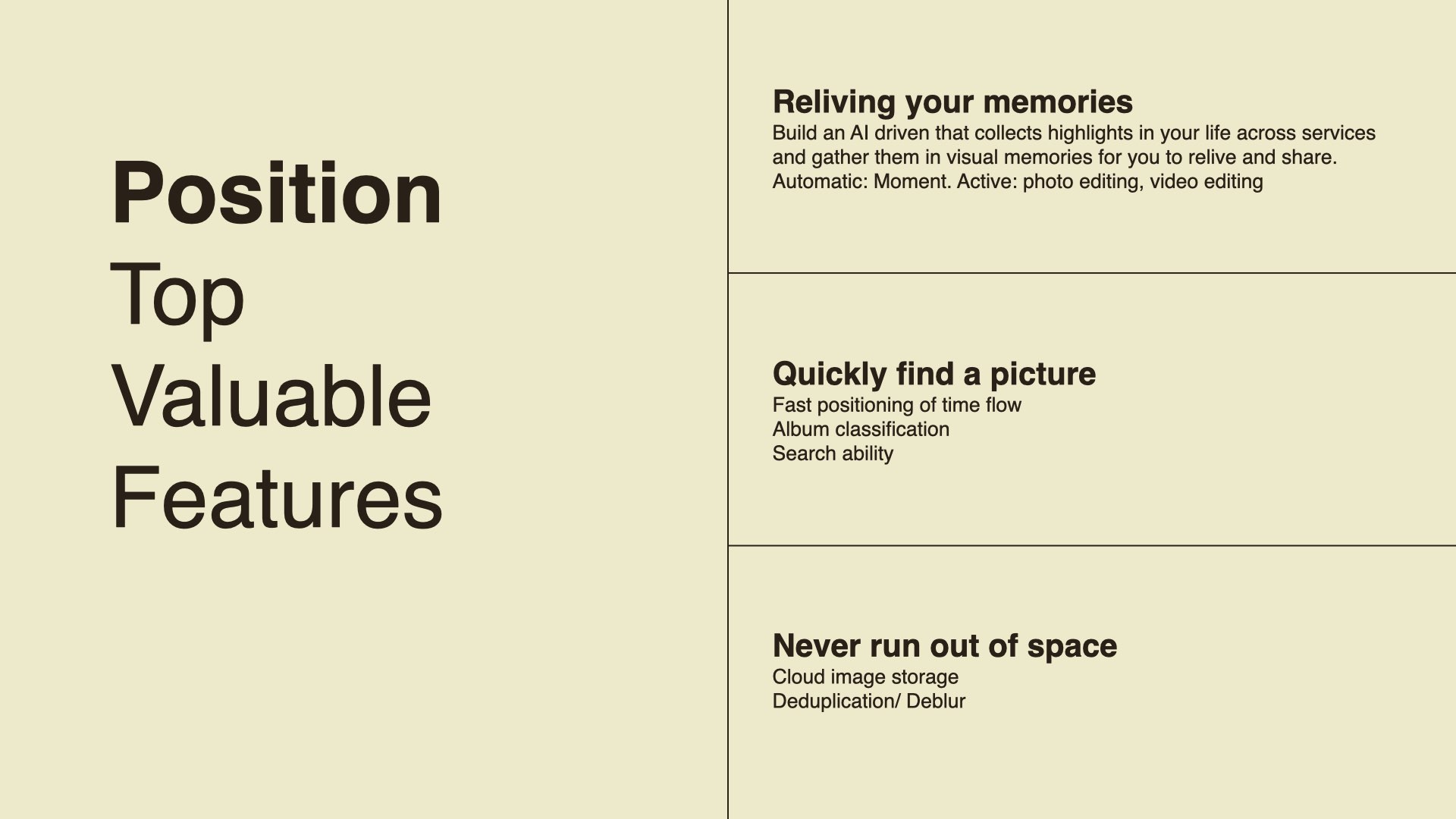
The conclusion was clear: the most valuable feature wasn't storage or organisation. It was helping users relive the moments that mattered to them.
This became the foundation for every design decision that followed.
A senior expert team brought ambitious proposals informed by external agency thinking. The concepts were strong — but they weren't grounded in the phone's design language. They couldn't ship as designed.
My job was to take what existed, judge what was actually buildable, and refine it into something that had both design quality and real-world viability.
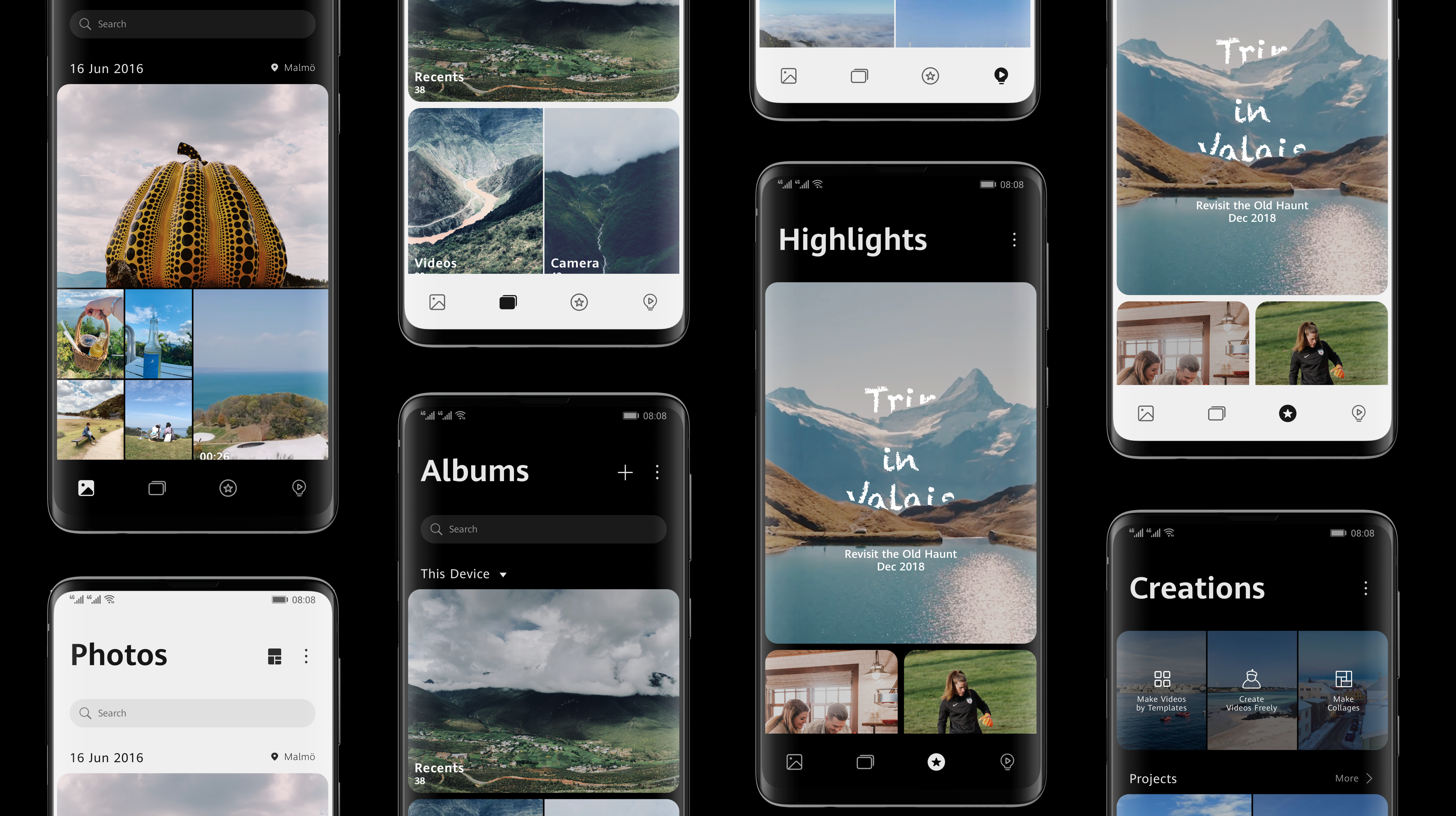
Photos / Albums / Highlights / Creations — four tabs built around user intent, not system logic.
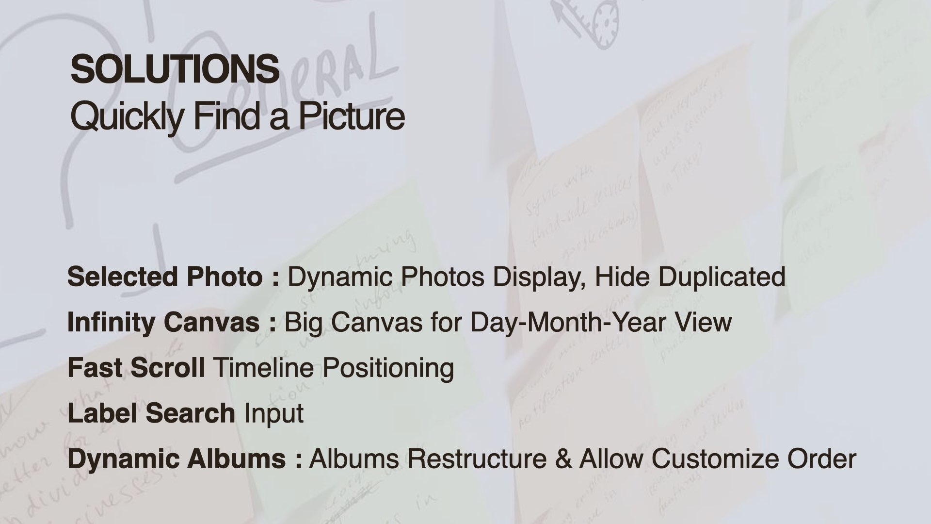
Visible search bar. Search by photo. Recommended labels. Timeline pinch-zoom for fast positioning.
Dynamic display that surfaces what matters. Duplicates hidden automatically.
A big canvas for day-month-year browsing — so time becomes navigable, not overwhelming.
The proposal also explored a broader vision — cross-device photo sharing across phone, TV, tablet and watch as a unified experience.
Memories surfaced automatically. Highlights shared seamlessly across devices. A continuous experience that followed the user, not the device.
This vision extended beyond the immediate product scope and wasn't implemented in this release — but it shaped how Huawei thought about Gallery as a cross-device product going forward.
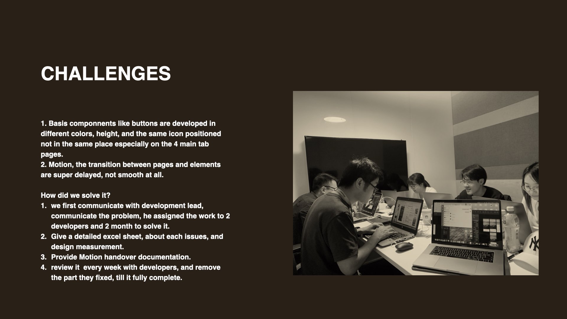
Design was done. But the app still had severe problems — buttons at different heights and colors, icons misaligned across the four main tabs, transitions so delayed they broke the experience.
No one was assigned to fix it. I decided it had to be done.
Gallery & Camera — the most-used app on the device.
Selected Photo featured in Huawei's official marketing and launch campaign.
Still in use today — the structure defined in this project outlasted the release.
User ratings improved notably following the EMUI 11 launch.