From zero to launch — and back again with data.
Most projects end at handoff. This one didn't.
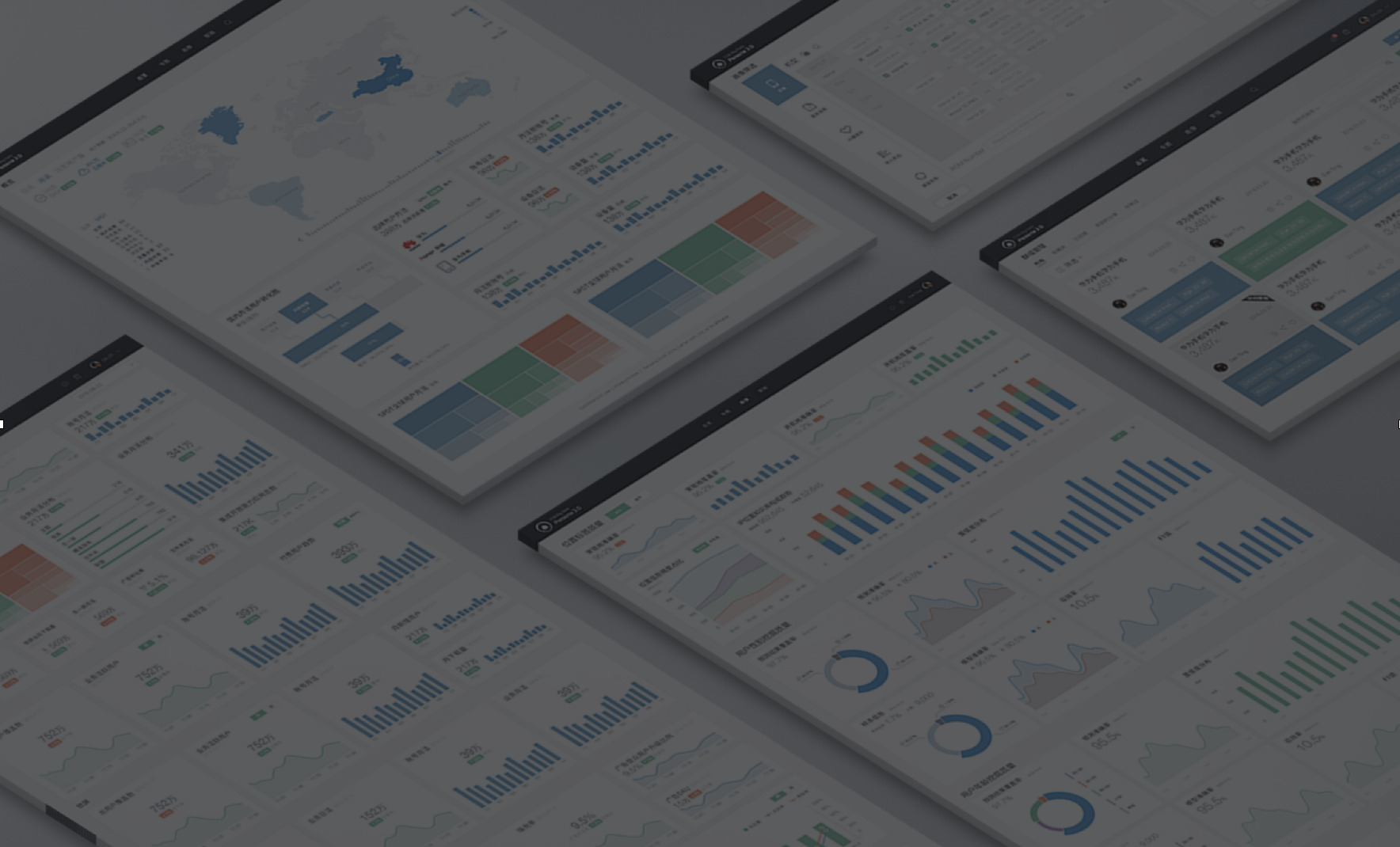
A big data analytics platform for Huawei's mobile operator clients — designed from scratch, shipped to production, and then validated with a full usability study including eye-tracking.
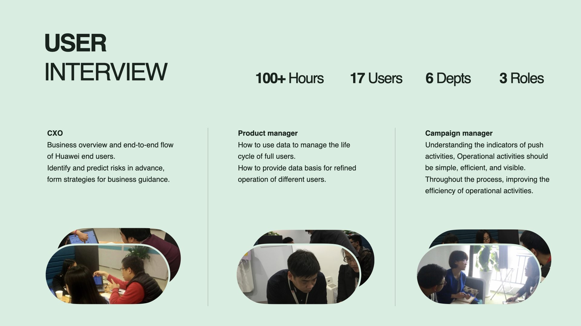
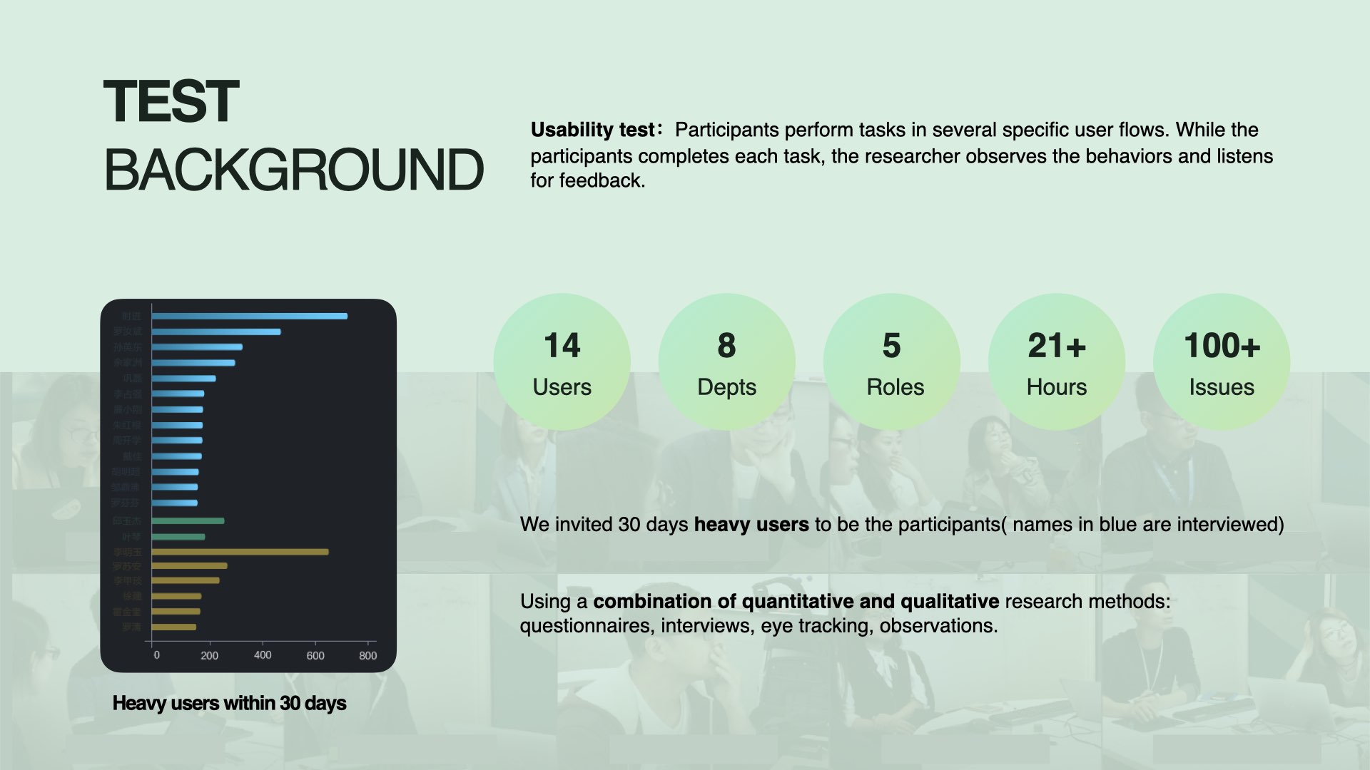
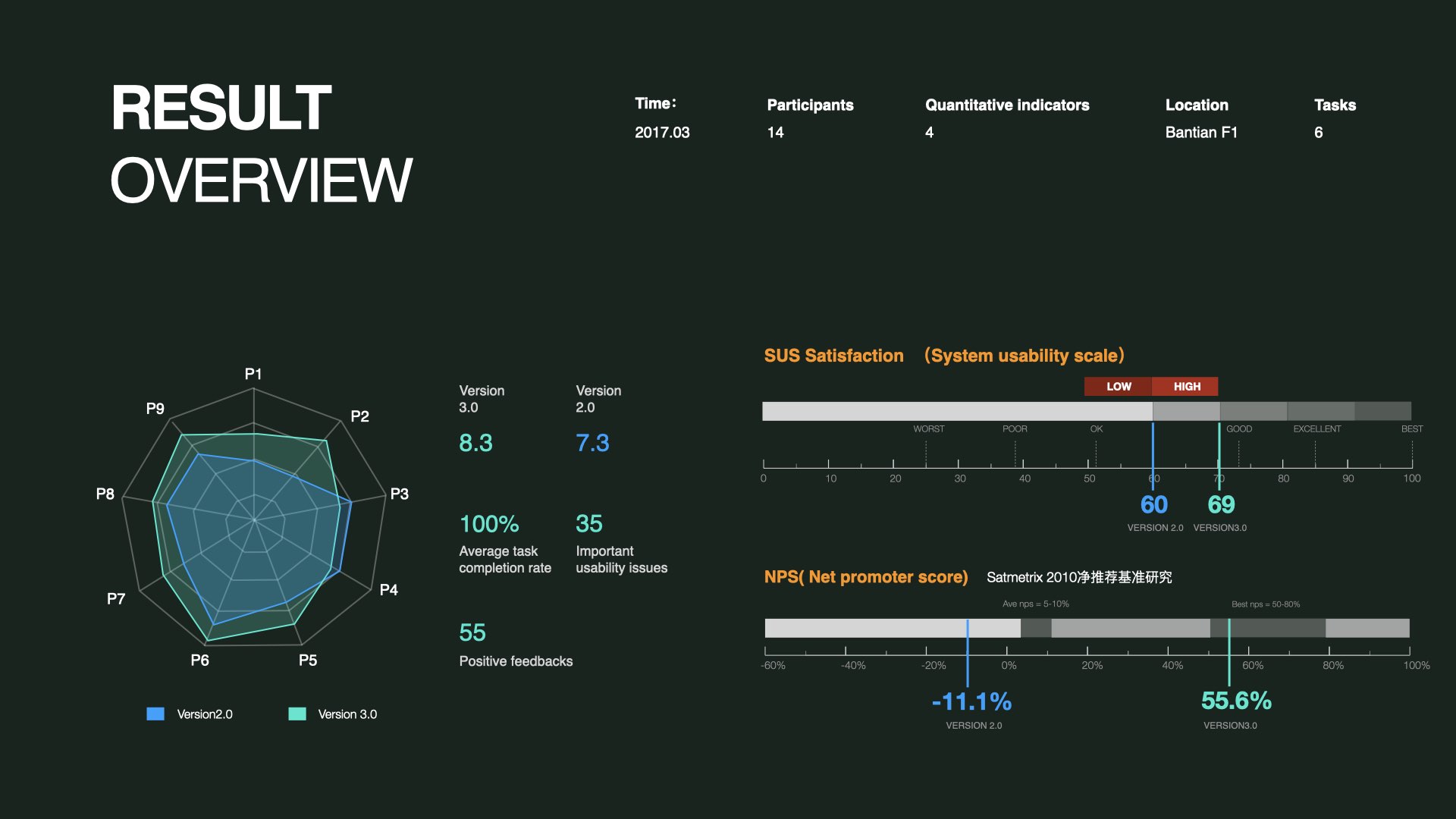
100+ hours of research. 17 users. 6 departments. 3 roles. One complete cycle.
Version 2.0 had reached its limits.
Huawei's terminal mobile user base was growing fast — but the existing platform couldn't keep up. Limited user tags. No campaign workflow. No way to support the daily operational needs of the business teams depending on it.
The brief: rebuild the platform from scratch to serve data management, user insights, campaign execution, and performance analysis.
Three roles. Fundamentally different needs. One platform to serve all of them.
The platform had to work for users who didn't share the same goals — or even the same definition of "value."
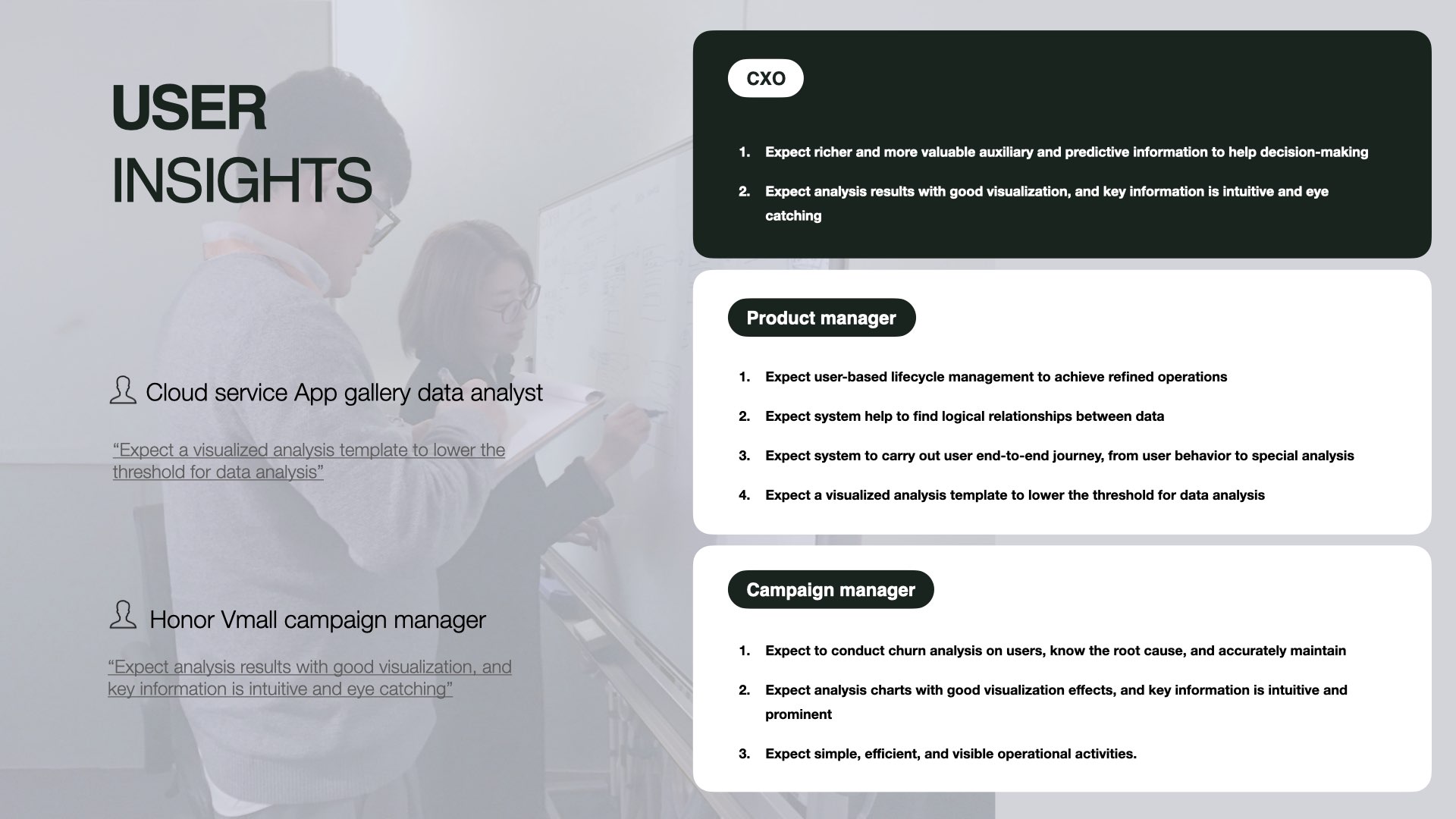
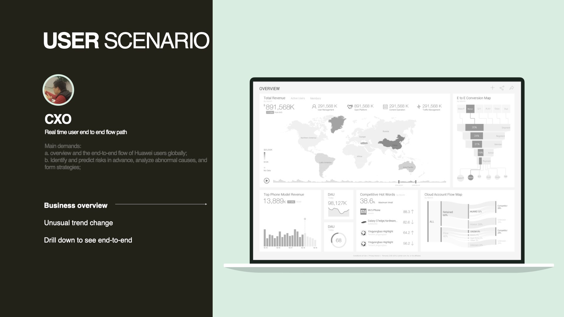
Needs a business overview and end-to-end flow of Huawei's global users. Expects richer predictive information to support strategy — not just reports.
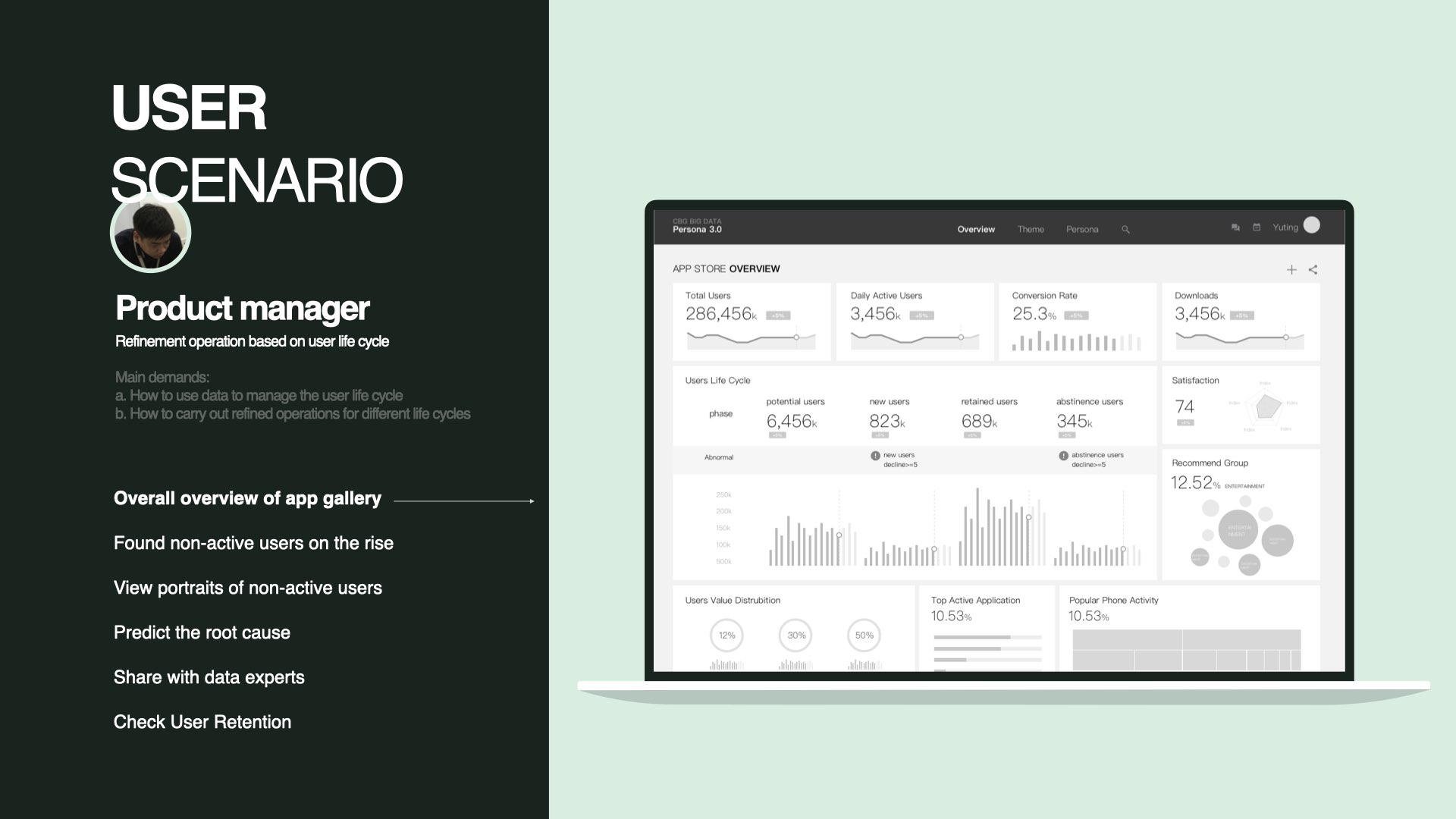
Needs to manage the full user lifecycle through data. Expects the system to surface logical relationships and carry the user through end-to-end journey analysis.
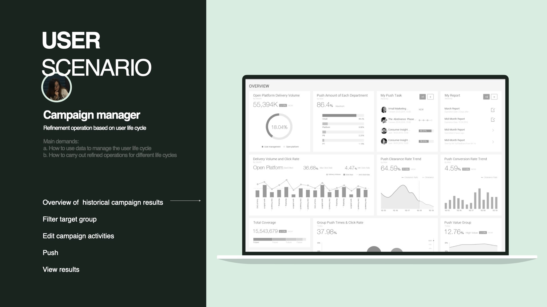
Needs campaign operations that are simple, efficient, and visible. Expects to understand churn, act on it, and track results — without friction.
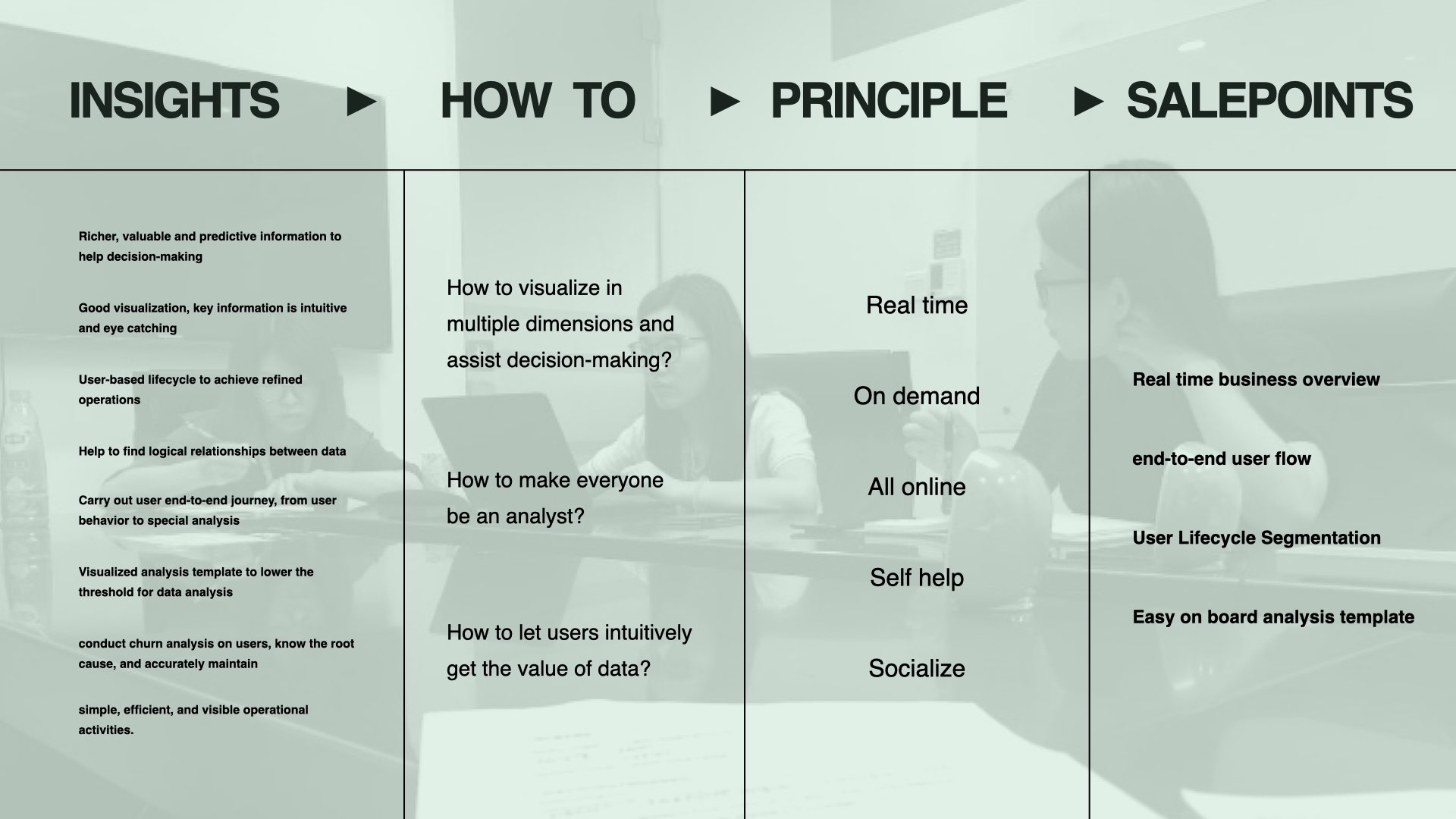
Three questions shaped the work:
The answers were different for each role. The interface had to hold all three.
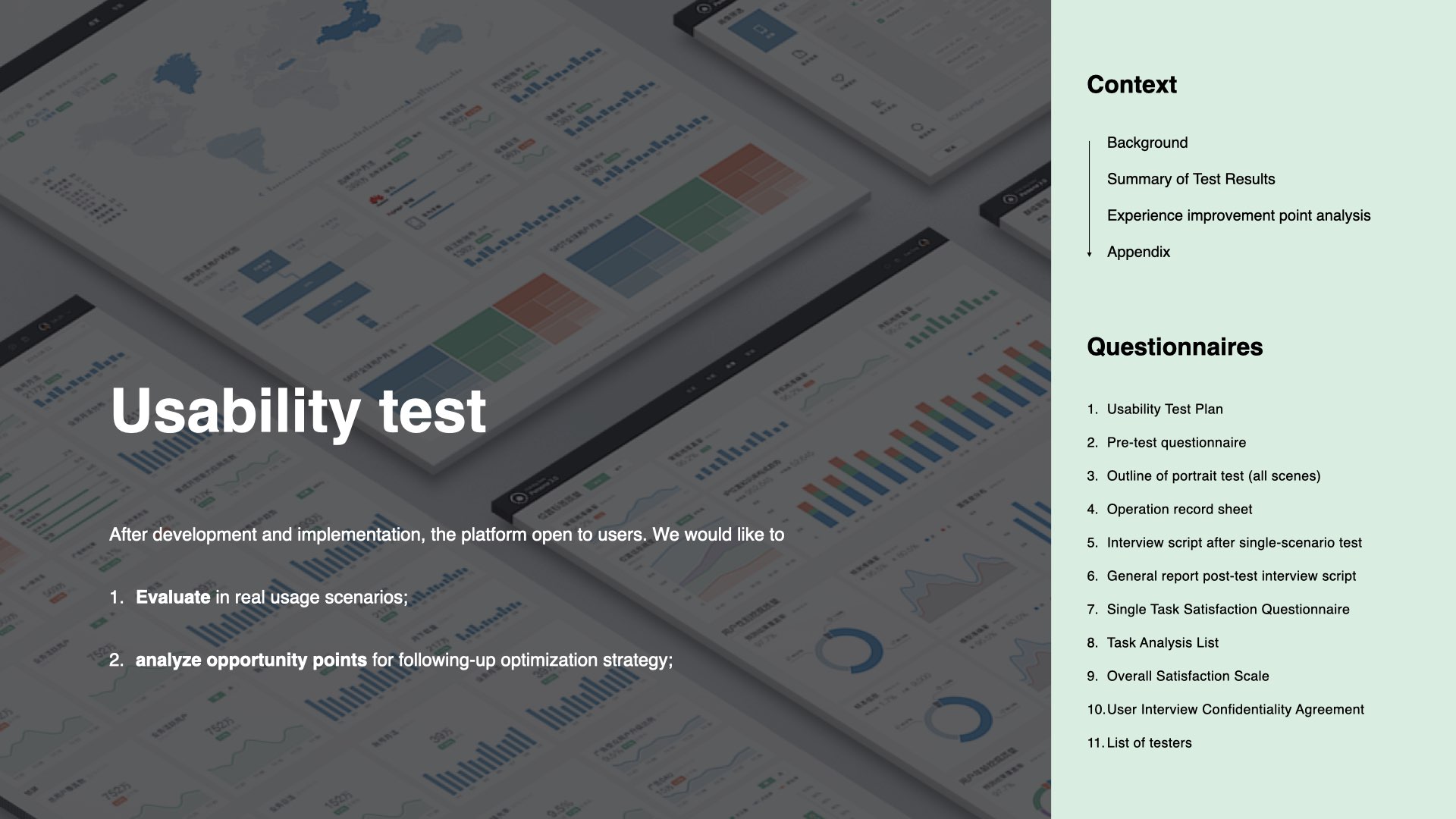
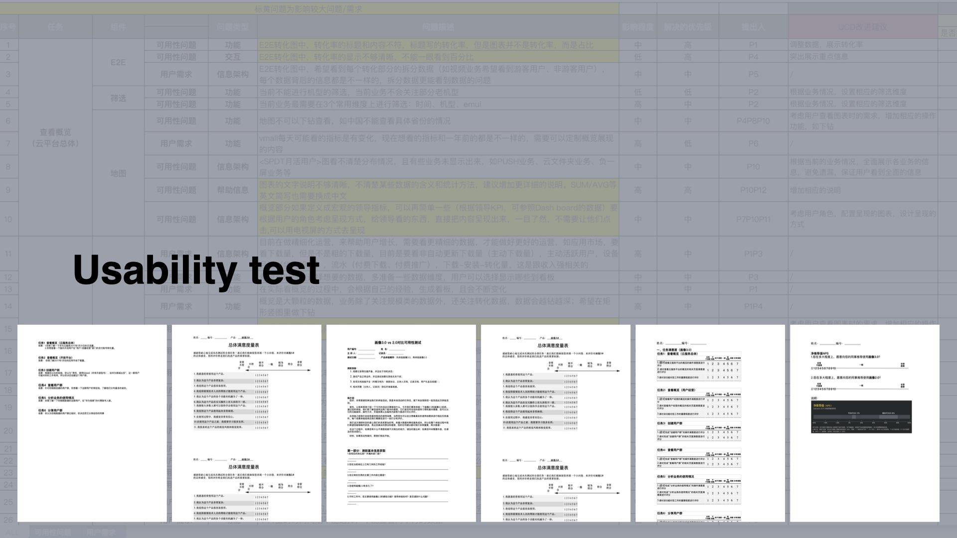
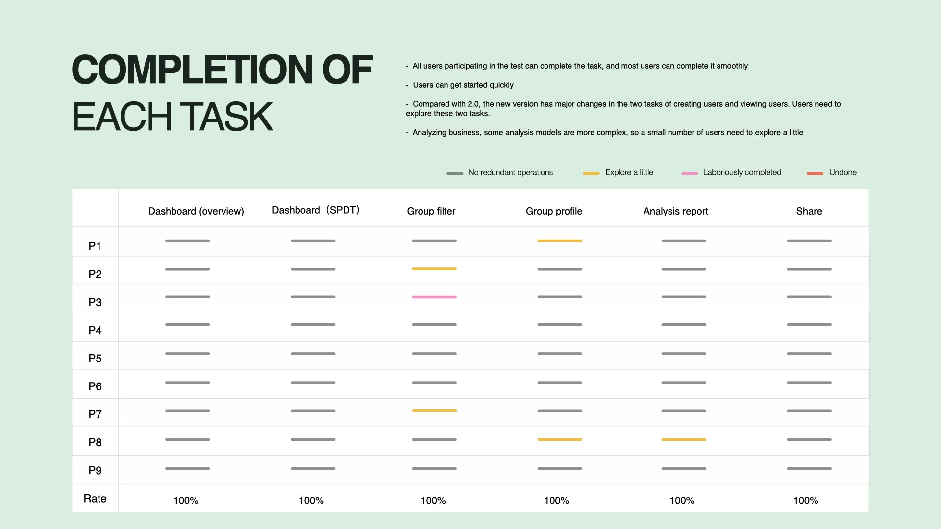
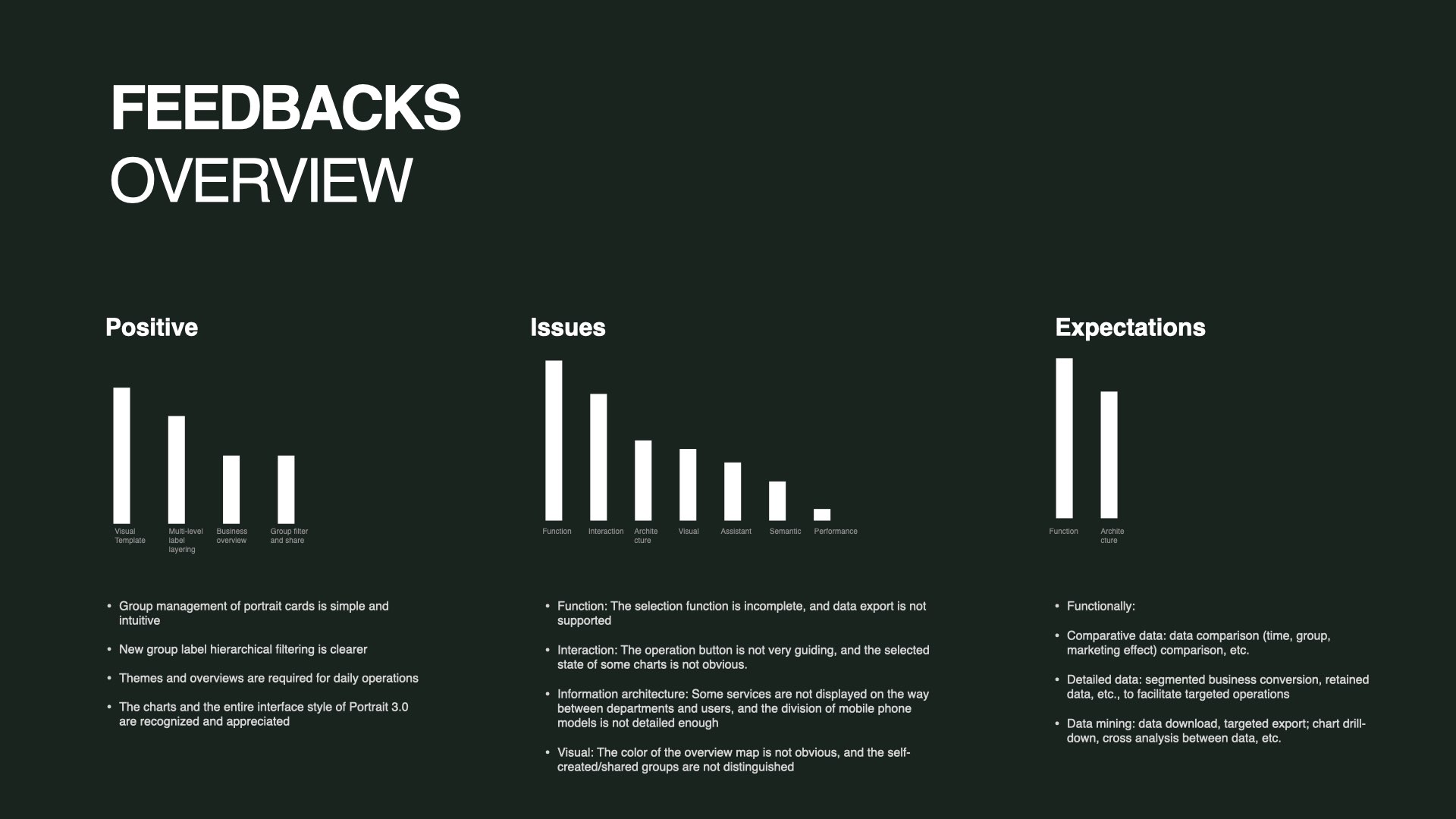
After development and launch, the platform was opened to real users for structured usability testing.
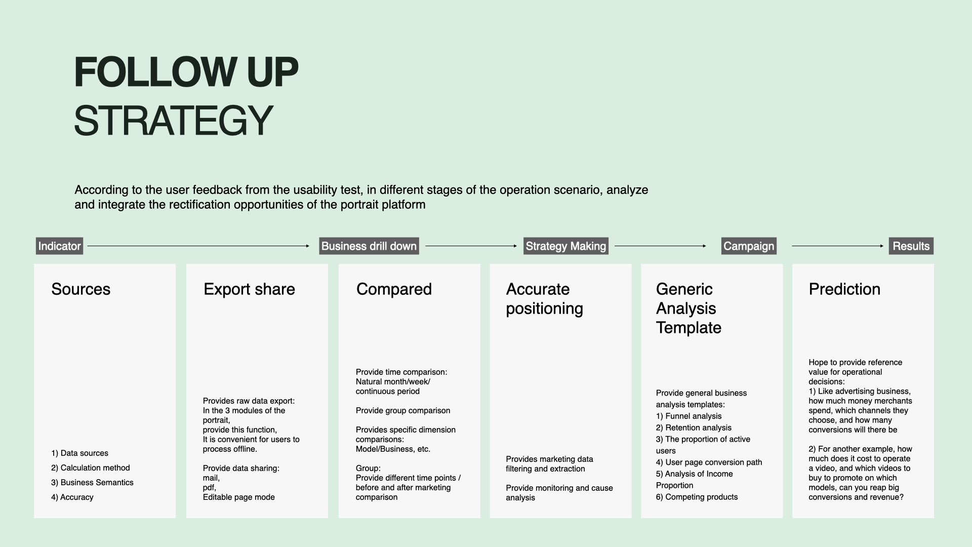
The goal wasn't to confirm what worked. It was to evaluate in real usage scenarios — and identify opportunity points for the next iteration.
17 participants. 30-day heavy users. Quantitative and qualitative methods combined: questionnaires, interviews, observations, and eye-tracking.
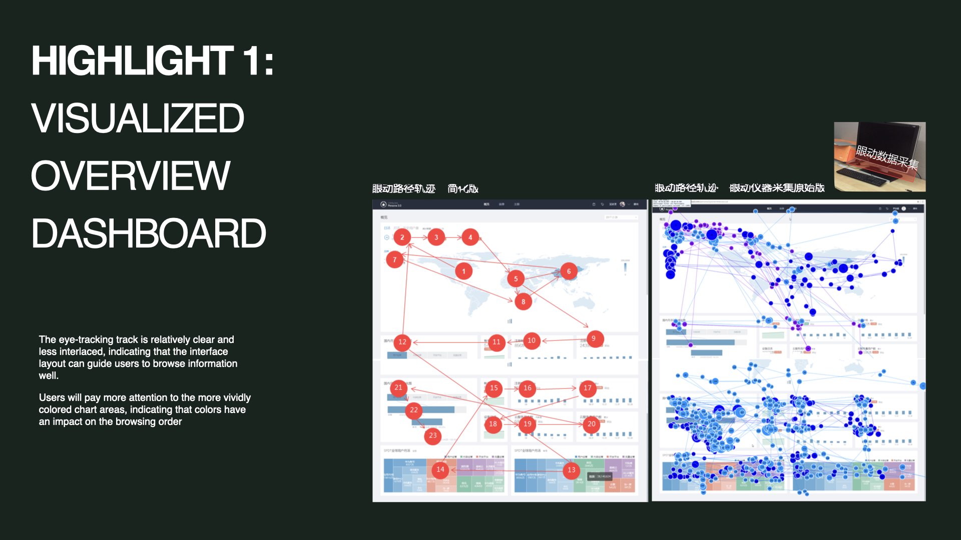
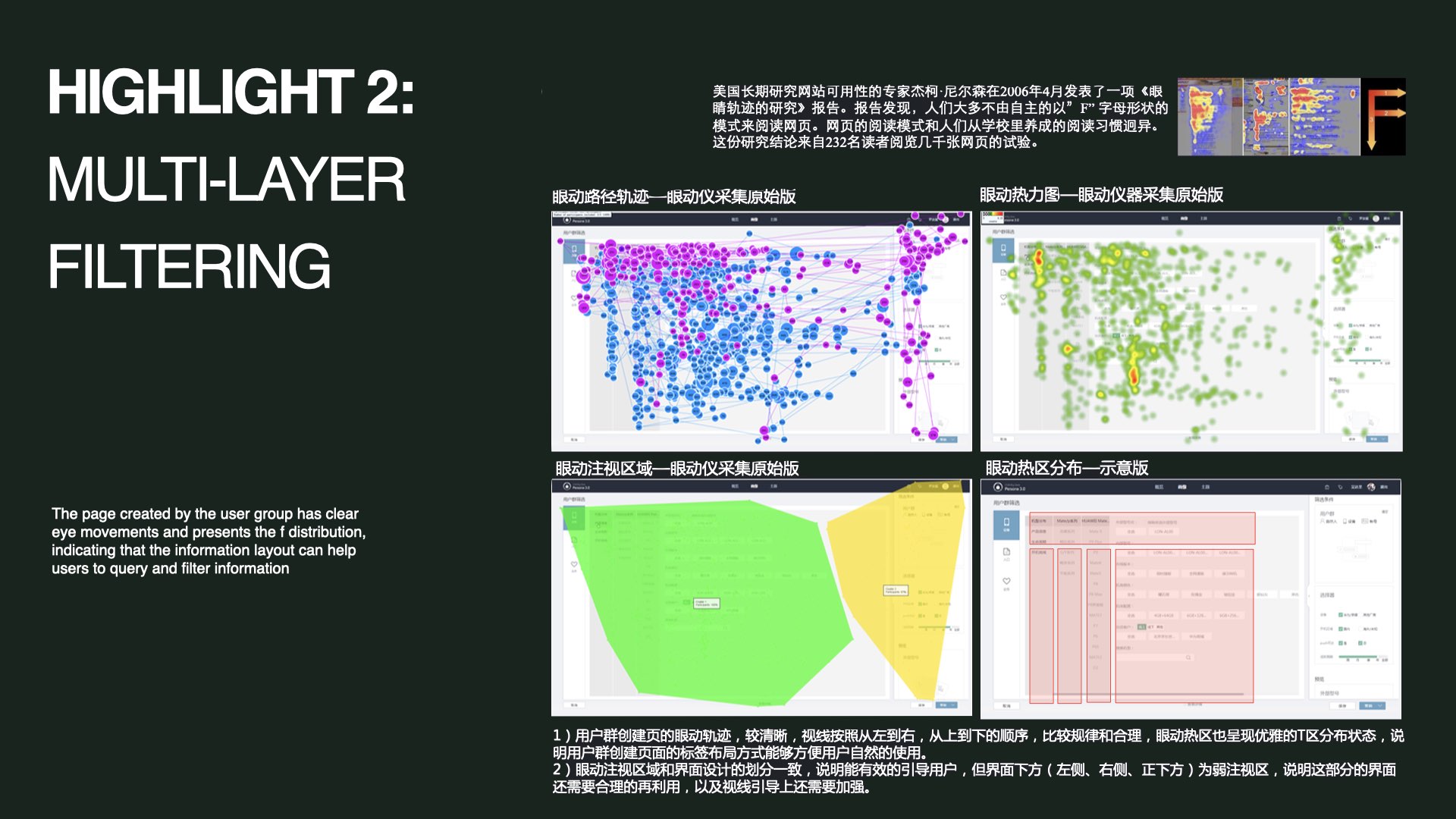
Two findings stood out.
CXOs, product managers, and campaign managers — all served from one platform.
Real users. Real scenarios. 30-day heavy users recruited for the study.
From discovery through post-launch validation. One complete end-to-end cycle.
Eye-tracking confirmed scan paths followed intended layout logic.
"Most design decisions are validated by instinct.
This one was validated by data."