Built from scratch. Adopted company-wide.
Huawei had a brand. What it didn't have was a digital design system.
Across mobile, enterprise, and beyond — every product team made their own decisions. The result was visible at every trade show: Huawei's digital products looked like they came from different companies.
This project was initiated by the brand team — top-down, company-wide — to build a shared foundation for all digital product lines.
My contribution: a mathematically predictable color system with guaranteed contrast ratios — and an accessible chart color palette validated for color blindness.
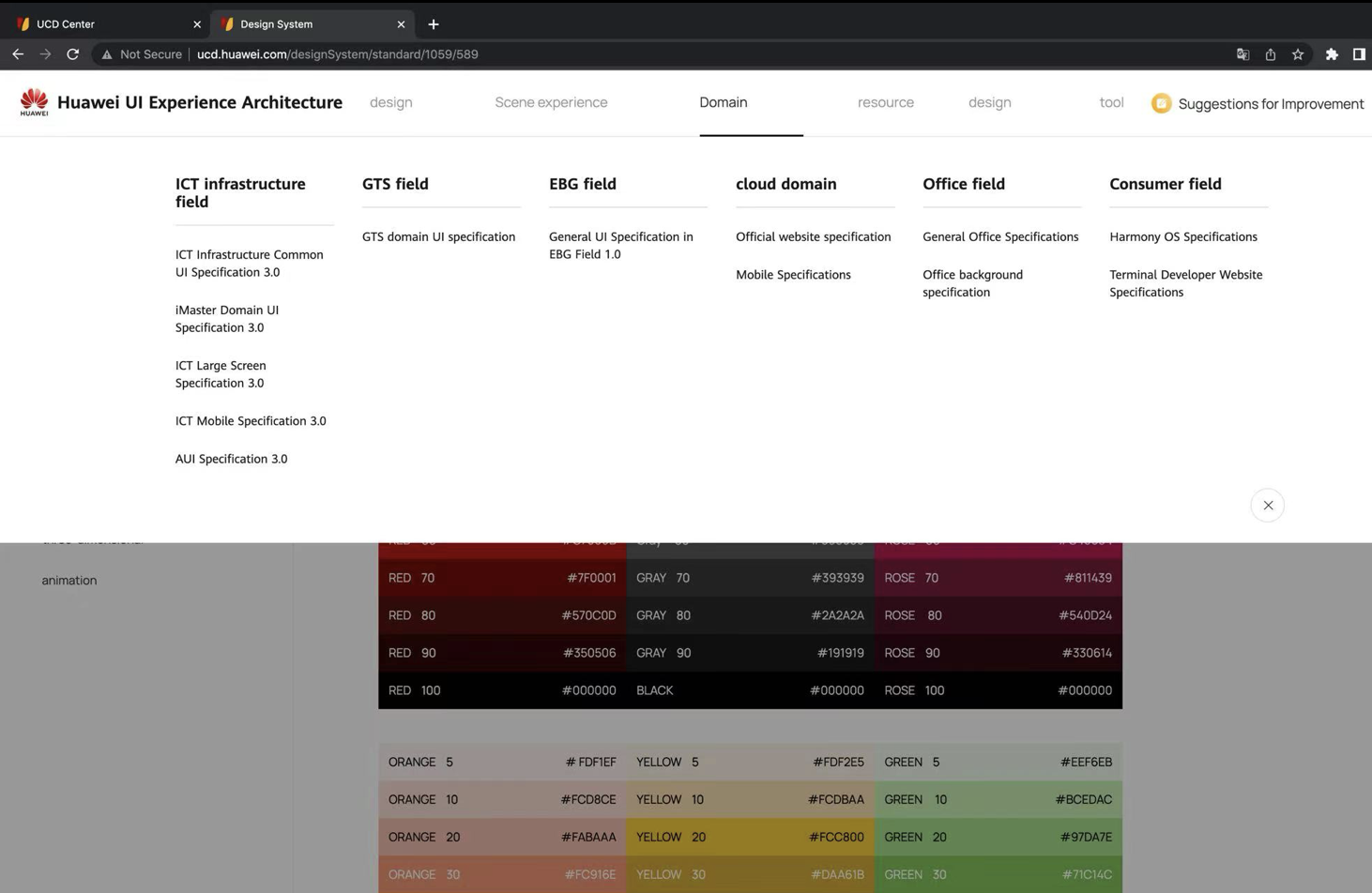
Huawei had no unified digital design system.
Despite a strong brand, there was no shared foundation for digital products. Mobile, enterprise, and platform teams each built their own visual language.
At trade shows, the gap was impossible to ignore: Huawei's digital products looked like they came from different companies.
The brand team initiated a company-wide effort to fix this from the top down — a unified digital design system built to serve every product line.
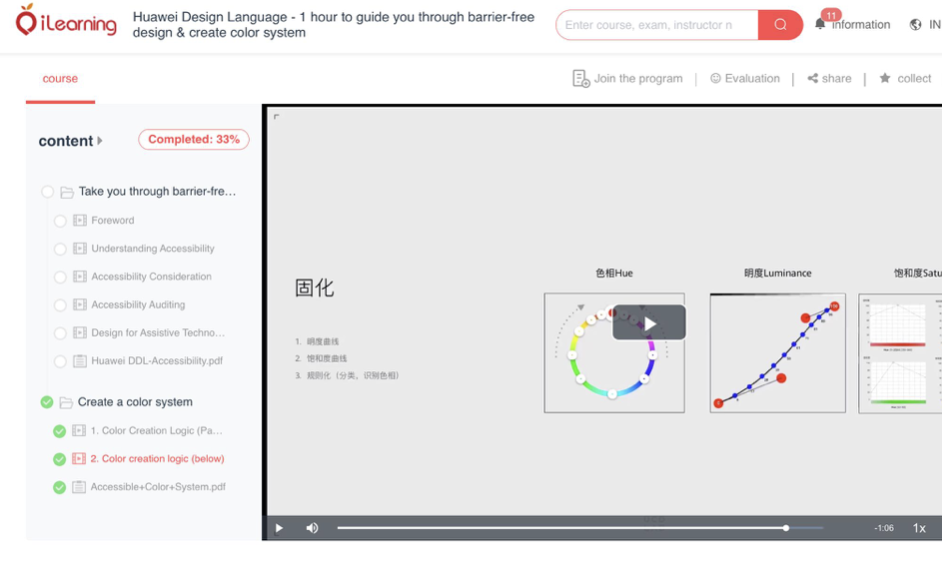
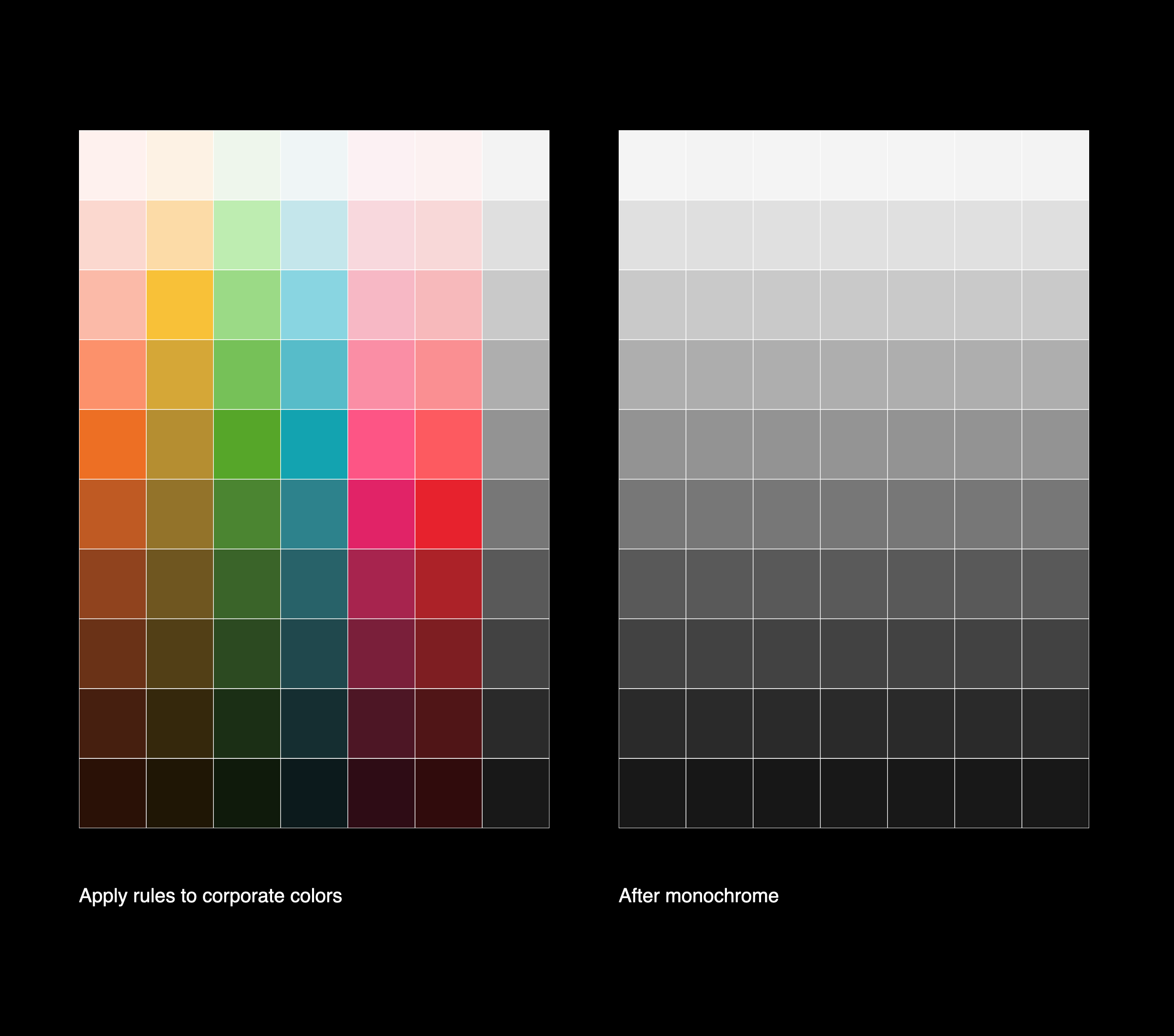
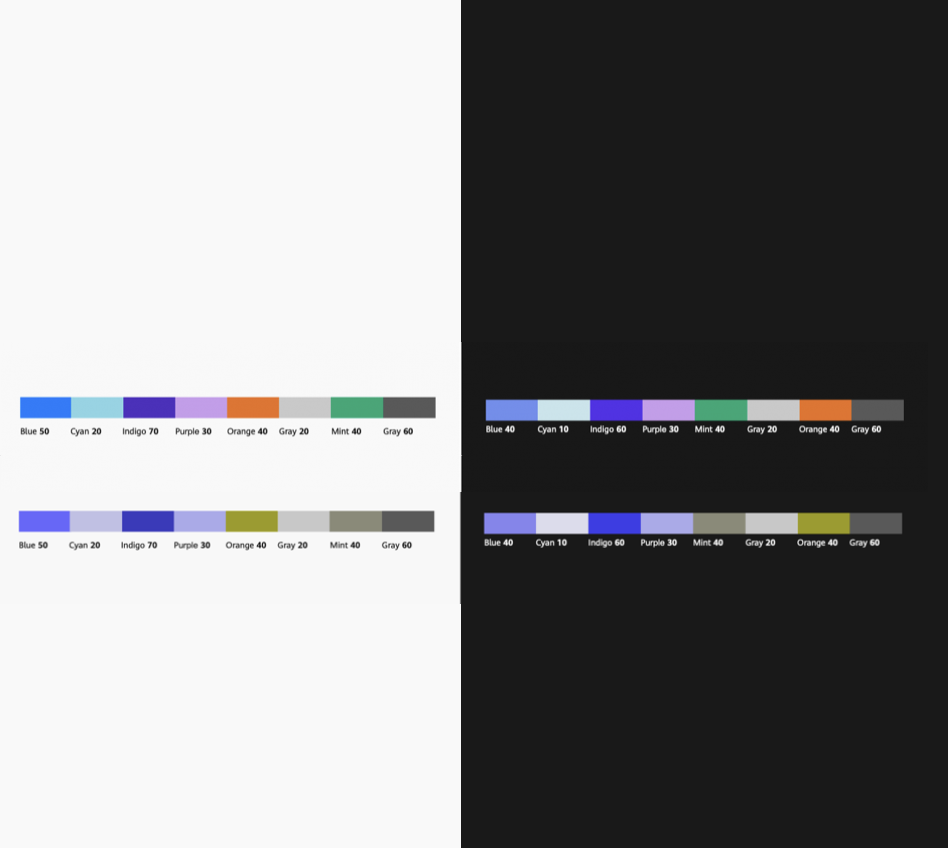
Standard RGB color spaces create uneven perceptual brightness across hues. A blue at 50% lightness looks darker than a yellow at 50% lightness — introducing visual inconsistency that's hard to pinpoint but impossible to unsee.
The foundation was HSLuv — a perceptually uniform color space where the same lightness value reads as equally bright across every hue.
Luminance follows a sine curve. Saturation follows natural environment-inspired curves.
The system was built in p5.js — generating every color stop programmatically to guarantee mathematical precision at every step.
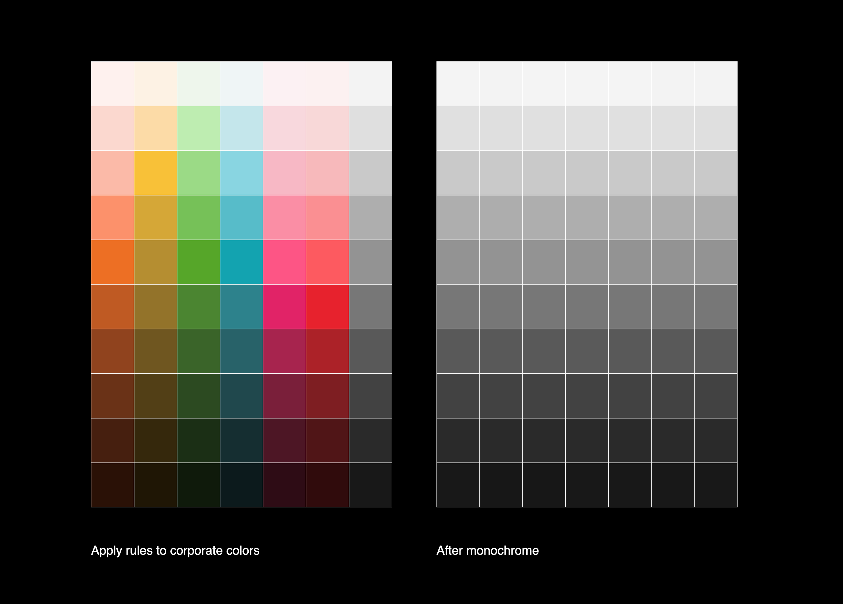
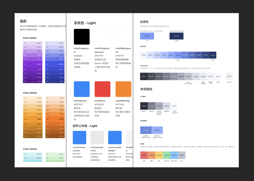
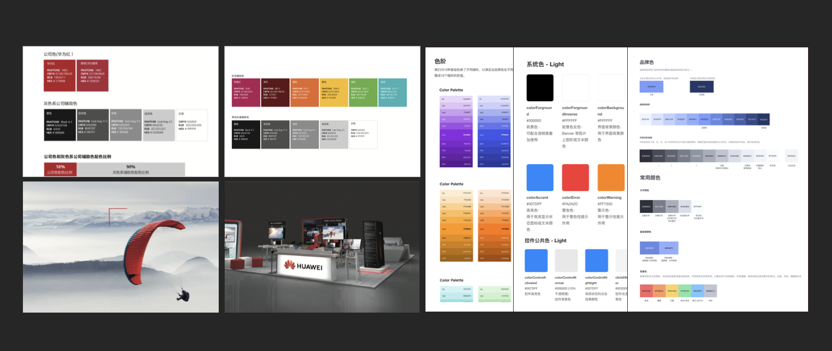
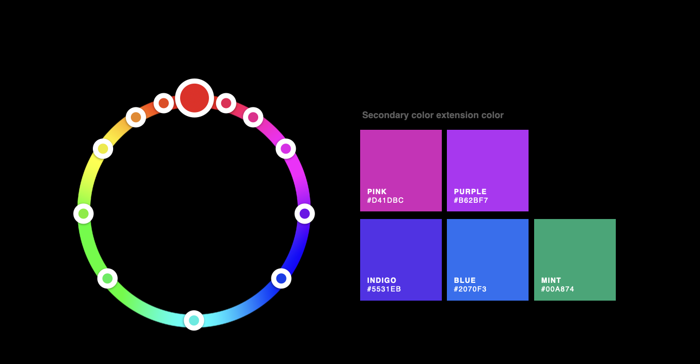
From Huawei's limited brand palette, a full set of product primitives was extended:
Rose · Orange · Yellow · Green
Mint · Cyan · Blue · Purple · Indigo
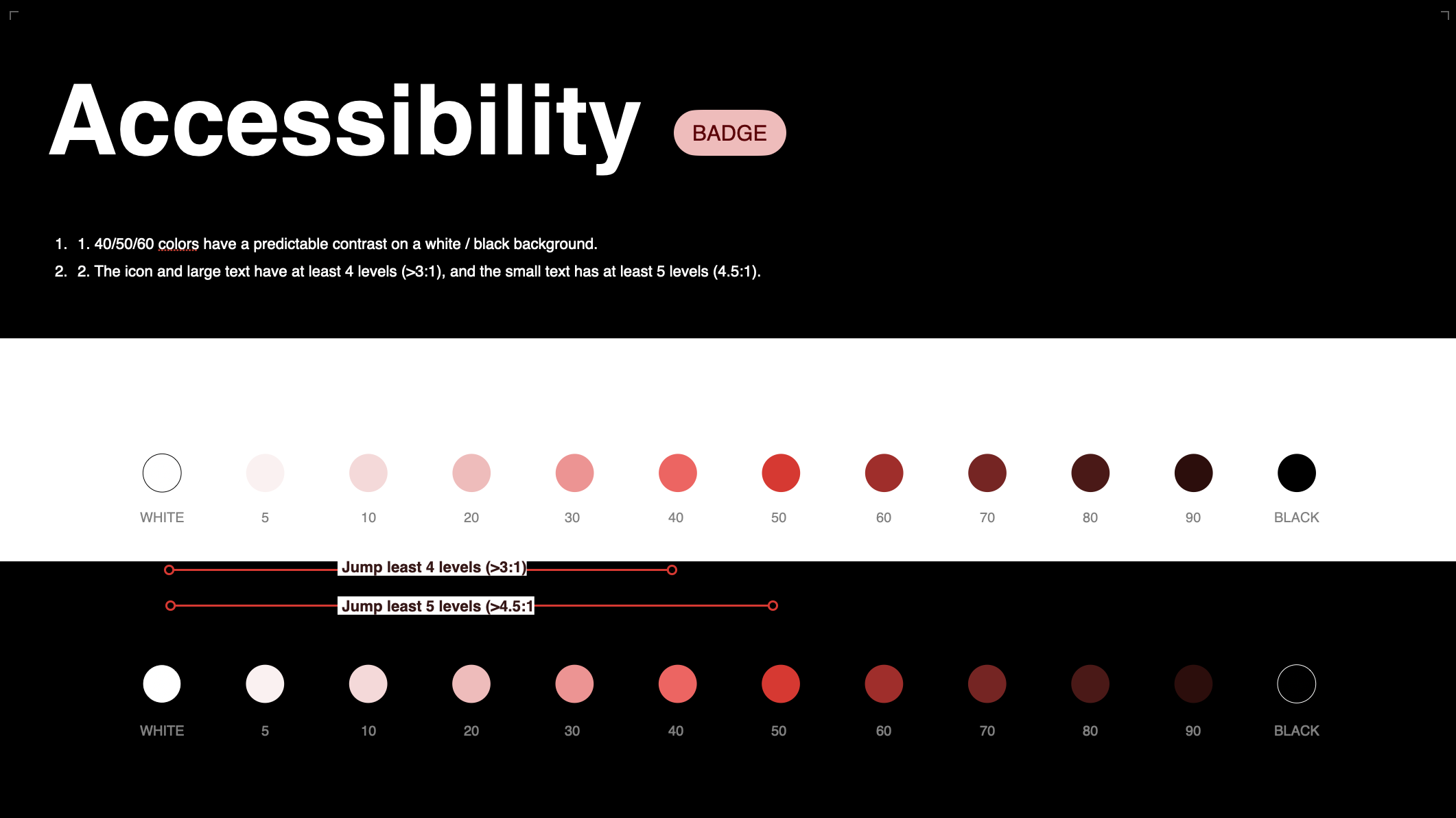
Each hue was built with 10 steps — and every color carries a subtle red undertone, reinforcing Huawei's brand identity across the entire palette.
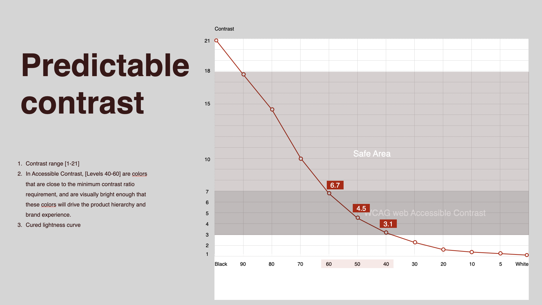
Most color systems rely on manual checking. This one doesn't.
The system was built on two predictable rules:
Any designer working with the system knows exactly what contrast they get before they place a single element. Designers don't need to check contrast manually. The system guarantees it.
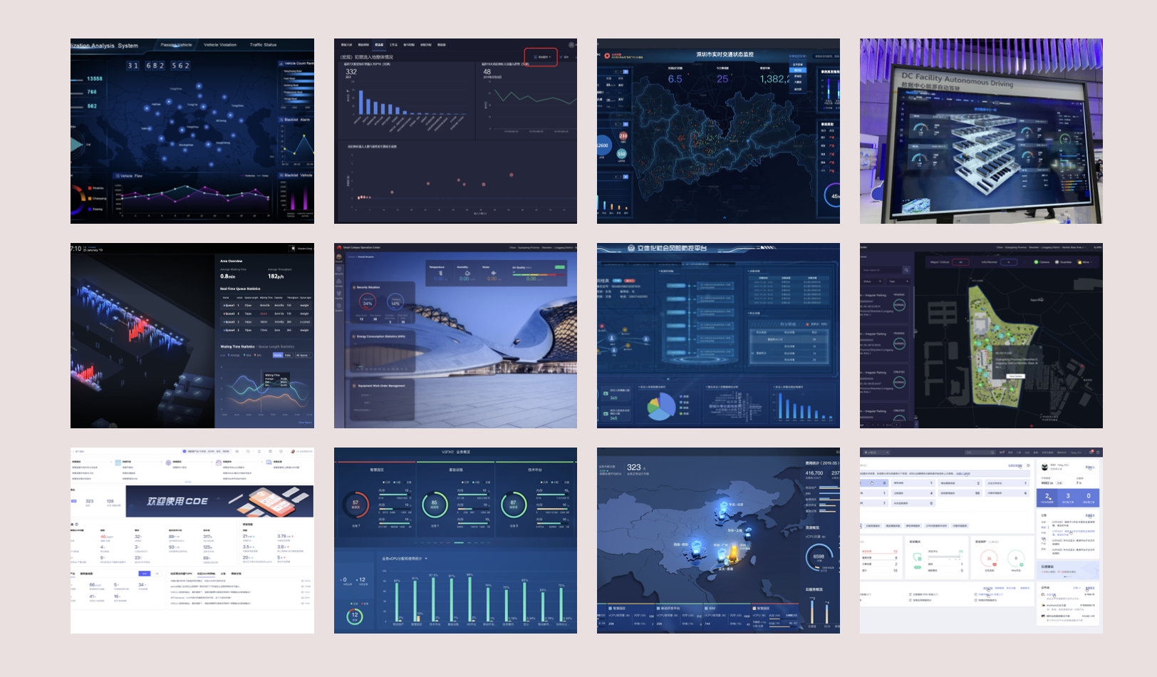
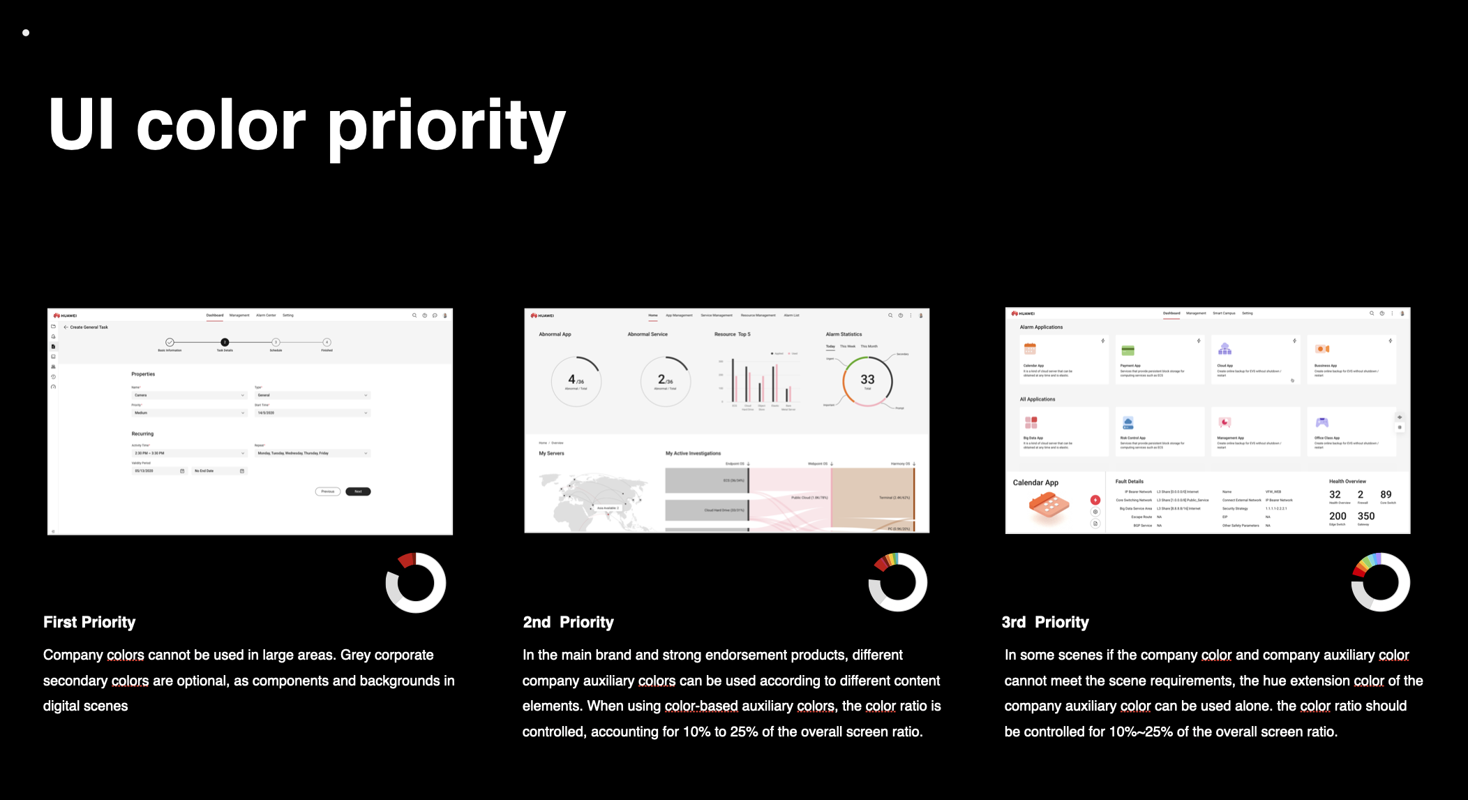
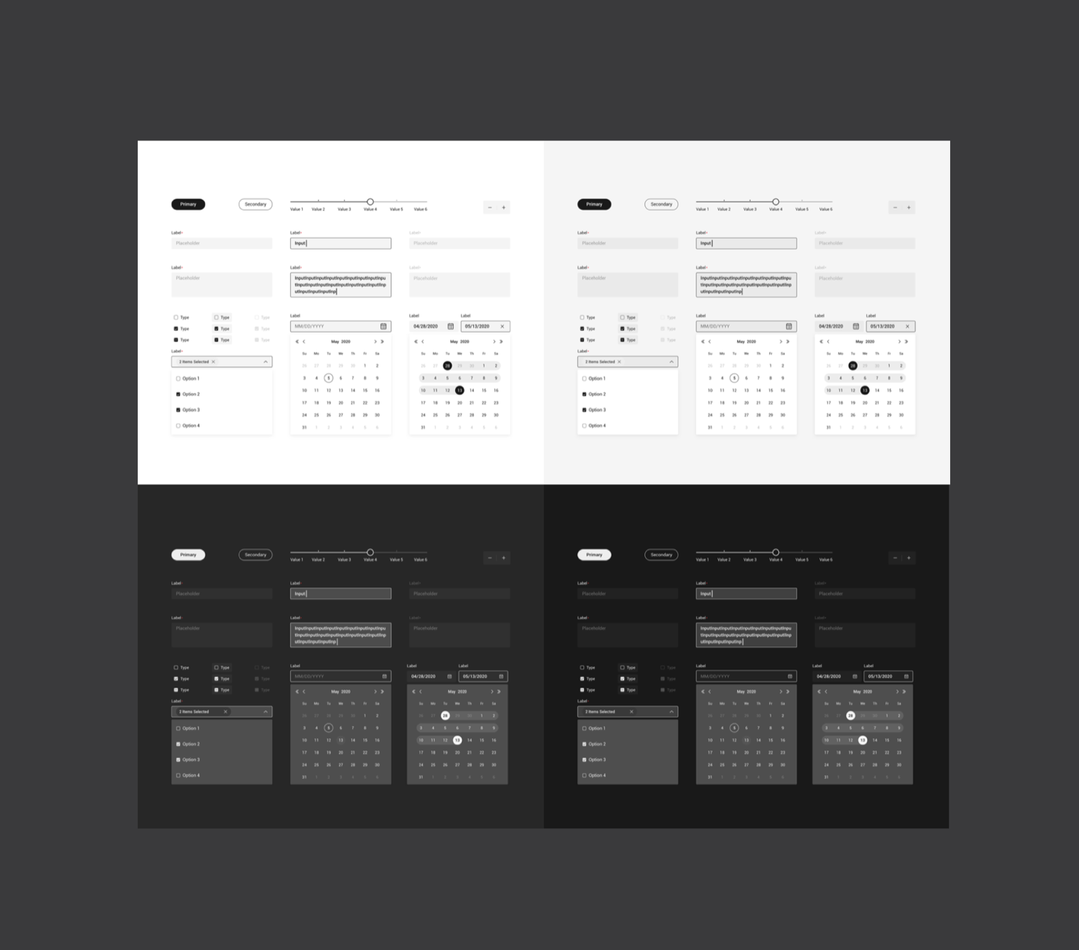
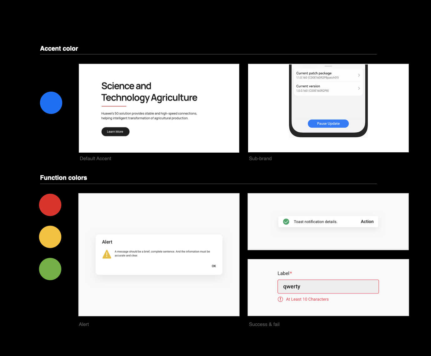
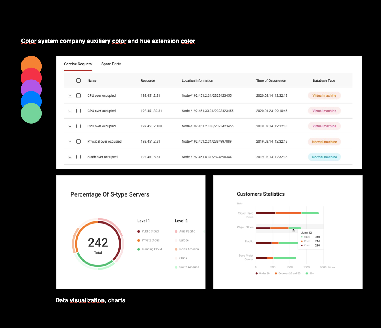
Applied across UI components, data visualizations, and interface patterns.
A dedicated chart color palette was developed specifically for accessibility — validated for color blindness to ensure data remains readable regardless of vision type.
Adopted across Huawei's entire product ecosystem.
One system. Every product line aligned.
Standard, red-green, and blue color blindness. Accessible by design, not by accident.